Today I biked to a meeting at Les Ateliers du Théâtre de l’Île on Rue Garneau. Some sections of my route were sufficiently icy that I would not have ventured down them sans studded front tire, so on the map I’ve hi-lited those sections in red. As you can see these sections are intermittent and avoidable. It was great to see many people out biking throughout this blustery day.
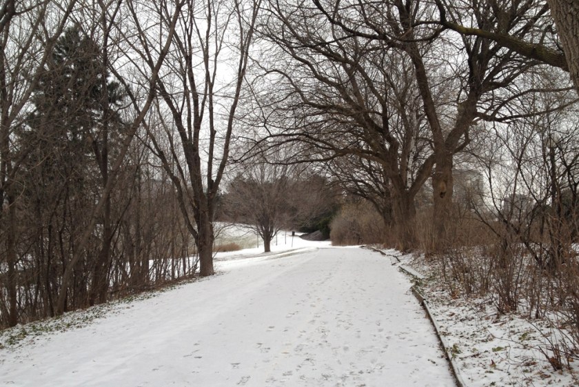
There was some slick ice lurking beneath the dusting of snow along this off shoot of the Ottawa River Pathway, just west of the Portage Bridge, up the hill from where the kayakers big storage containers are located.
A bit further on, just west of where the path goes under the Portage Bridge, one section is cleared and salted. I came from the left.

It was a windy day, as suggested by the tufts of snow clinging onto this frozen section of the Ottawa river.

Where the path turns back under the Portage Bridge on the Gatineau side, there is a surreal soundscape of industrial steam pipes hissing and popping away intermittently all around. This wasn’t happening in the summer when I biked past on numerous occasions, so maybe it’s only a winter thing.
On the way back from my meeting I biked through Le parc Fontaine. It’s standardized modern facilities and layout belie the importance it held within the community over the years, as described on this interpretive panel situated on the southern edge of the park.

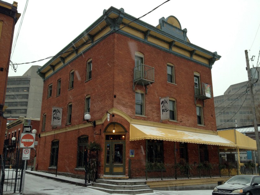
There are a number of beautiful old buildings along Rue Laval and Promenade du Portage, such as these.

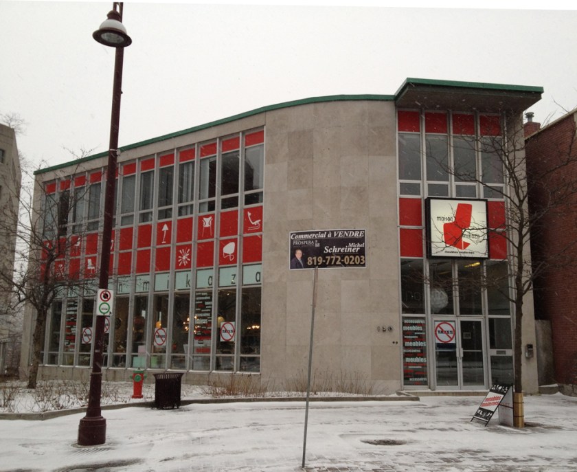
There is also this well preserved 60’s building where the two streets cross, suitably adapted as a modern furniture store.

I was all feelin’ warm and cozy looking at your photos until the last one. How can anyone selling “designer” furniture do such a poor job on their signage??? Why are they staggering the silhouettes of the furniture? please delete the last photo.
Other than that, I think that this is one of you best blog posts for photos.
Well I won’t be deleting the last photo, but thank you for your comments. You raise some fine points. If the idea is to be about good modern design they might have gone the extra mile on their signage. For example, if the silhouettes were along one line, vs staggered, they would be more sympathetic to the vertical and horizontal lines of the building. Similarly if the backlit sign was recessed and drop out white logo on a red background. Maybe they were under certain constraints that led to the final design decisions. I’m sure the ‘commercial à VENDRE’ sign wasn’t the store owners call. It’s even covering up some text engraved into the buildings facade which appears to be from the original building.
Hey B, just found this blog: http://urbsite.blogspot.ca/ Thought you might find it interesting. There is a good post about the Carlington Reservoir there. Nick
Hey Nick, that is a great blog. I will have to re-visit the Carlington Heights reservoir with this new info – but in the winter!